Flash Magazine, Countries
The layout seems staggered and messy and things are not actually lined up, i like how its jumpy and vivid. and the colors look good.
Flash Magazine, a gallery ad
I like how balanced and simple this is. and its very concise.
Swiss Design on Laurent Brutsche

it looks like the letters got draged to the top and smeared the whole page. It dosent look static anymore but engaged with time and movement. I like how much of the page the title occupies. and just a little bit word on the top middle to balance it.
Karl Gerstner: Review of 5×10 years of graphic design

the overlapping hands in different colors look great. words subtly appear next to the image and merge into it. I like the product of mixing colors while overlapping.
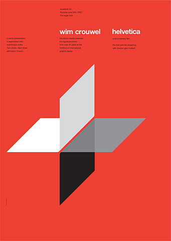
Ross Gunter: rossgunter.com

The big geometric shape catches my eyes. Four shapes touch and overlap at the end, which aslo indicate what the title says, bridging the gap, and also reflects the logo.
Graphis 113 ? 1964
http://www.smashingmagazine.com/2009/07/17/lessons-from-swiss-style-graphic-design/

it is so bold and imposing. The texts inside of boxes are integral parts of the whole image. the sparse words contrast the big chunk of black, and create contrast among black, grey and white, three shades.
Publicite 12

I think its cool that the colors divide the word into three parts. I like that vertical line of words, which breaks the repetitive horizontal lines.
Tactic Poster: _Untitled-1
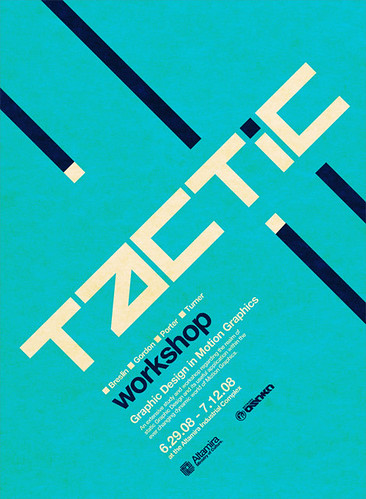 i like the colors in this poster. and also how the artist incorporated the style of "i" into the design of diagonal lines. I also like the font in this poster.
Corporate Diversity – Swiss Graphic Design and Advertising by Geigy 1940-1970
 this design has a fresh looking. The bottom larger font weighs down the whole composition, and reflects with the top larger font. I like the upper empty space to let the texts breathe.
wrongdistance.com/wp-content/uploads/2008/01/mikelemanski4.gif
this design has a fresh looking. The bottom larger font weighs down the whole composition, and reflects with the top larger font. I like the upper empty space to let the texts breathe.
wrongdistance.com/wp-content/uploads/2008/01/mikelemanski4.gif
 I like this because of the color palette, and overlapping of concentric circles. It seems to have 8 rows, but the layout is compelling and simple.